Plotting With Plotly
Please Log In for full access to the web site.
Note that this link will take you to an external site (https://shimmer.mit.edu) to authenticate, and then you will be redirected back to this page.
Ok this shouldn't be too nasty of an assignment.
On the server, activate the same python virtual environment you were using for your Flask App. Install four things/libraries:
Install numpy, this might already be installed, but just do it anyways:
pip3 install numpy
Install pandas, a really cool data manipulation library:
pip3 install pandas
Install plotly, a really cool plotting library:
pip3 install plotly
Install this one library that the Raspberry Pi might not have to support the Python libraries we just installed.
sudo apt-get install libatlas-base-dev
Ok.
Templating
The first thing we'll do with our Flask app is to introduce templates. Templates are a way to make customized HTML from Python. It is basically a merger of serving a static html file like we did two weeks ago and the ability to create dynamic content like we did with Flask. In your Flask application directory, add a folder called templates. Into that folder make a file called template.html and into that file we'll add the following text:
<!doctype html>
<html>
 <body>
  <h1>Test Title!</h1>
  <p>It is a day in the history of the universe.</p>
</body>
</html>
Now in your Flask application, update your import line at the top (the one related to Flask) to say the following:
from flask import Flask, request, render_template
After that add another endpoint to your application called template_test and to it add a simple callback function like so:
@app.route('/template_test')
def tt():
    return render_template('template.html')
Restart your Flask application. Revisit your server. If you go to ERROR/efi_test/template_test you should see the contents of the HTML file above now rendered properly in a web browser (because it is html. For reference, it should look like my site here.
Adding Content to a Template
OK so far the template is boring...but what if we could "inject" the results of Python calculations into the stuff that gets rendered? Well you can! Modify your template.html file so that it looks like this:
<!doctype html>
<html>
 <body>
  <h1>Test Title!</h1>
  <p>The current time is {{ time_stamp }}!</p>
</body>
</html>
What we've done is add (using the {{ and }} demarcators, a variable to be specified. When flask renders this template, it will inject whatever value we tell it. So let's add something "dynamic" like a timestamp. Modify the part of your flask app that is rendering this template so that instead, you get the current timestamp like so:
@app.route('/template_test')
def tt():
    now = datetime.datetime.now()
    return render_template('template.html',time_stamp = now)
Restart and then you should have something that gives an ever-changing timestamp every time you refresh and visit the page. For reference, it should look like my site here!
Plotting
OK, now what we'd like to do is make a pretty looking plot and use it with a template. First let's update the libraries we import for our Flask application. At the top add these:
import pandas as pd
import plotly
import plotly.express as px
import json
Next in our templates directory add in a template that will have some boilerplate stuff that can render a plot. Call this template whatever you want, but remember the name since you'll be linking/using it in a bit.
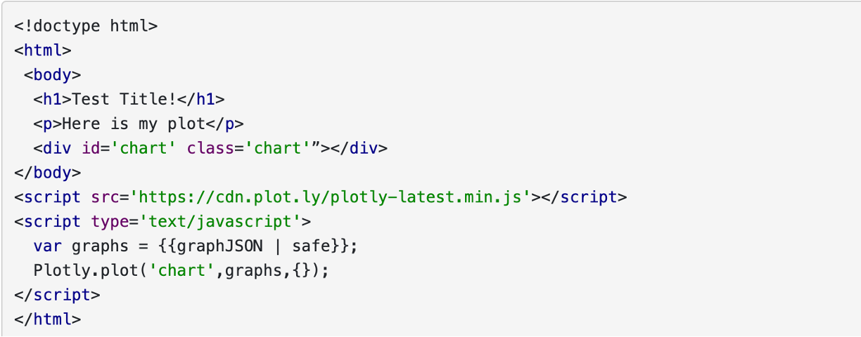
The template is mostly fixed content. The only thing that is dfferent is a variable we'll inject called graphJSON. What this variable will contain will be a large JSON object that will contain all the material needed for the Plotly javascript libraries to render a really nice, interactive plot. Our job, on the Python/Flask side will be to generate that JSON object...and we'll use Plotly's Python library to do so. In this way, we basically avoid having to write javascript or anything directly, and instead just use Python to do it for us, and that's good because Javascript is a disgusting, disgusting language.
The library and documentation for Plotly can be found here. In general, plotly's documentation is very good since they have a financial interest in you using their stuff (they let you use it for free and then try to hook you once you're using it in a commercial setting.) Anyways, you can totally mess around with Plotly locally on your computer. Everything you do there can be deployed on the server. The big difference, however is that where as locally you call:
fig.show()
And a browser will open up with your code, on the server you'll need to just pipe your generated figure into a JSON object using a function call that the plotly python library provides:
    graphJSON = json.dumps(fig, cls=plotly.utils.PlotlyJSONEncoder)
    return render_template('temp_plot.html', graphJSON=graphJSON)
An example of putting this all together is shown below:
@app.route('/plot2')
def plotter2():
    xs = list(range(100)) # make 100 points
    ys = [random.random() for i in xs] #import random! then assign random y values
    # make a nice data frame using pandas
    df = pd.DataFrame({
       'x': xs,
       'y': ys,
    })
    #make a line plot using pandas:
    fig = px.line(df, x='x', y='y')
    # turn into json object for export and embedding in template:
    graphJSON = json.dumps(fig, cls=plotly.utils.PlotlyJSONEncoder)
    now = datetime.datetime.now() #time stamp:
    return render_template('temp_plot.html', graphJSON=graphJSON, time_stamp=now)
The result of this plotting code is shown HERE. I am generating random numbers and plotting them in conjuction with a modified template from above.
Assignment
OK, using your SQL skills from last week, plot out, using a line plot, your temperature data over time that you previously logged (and maybe continue to log). Your result should have temperature on the y axis and the date on the x/t axis. You will need to do some digging into the plotly docs to see how to use timestamps appropriately!
For credit on this question, drop a link to the temperature plot hosted on your server.
